Design Theory
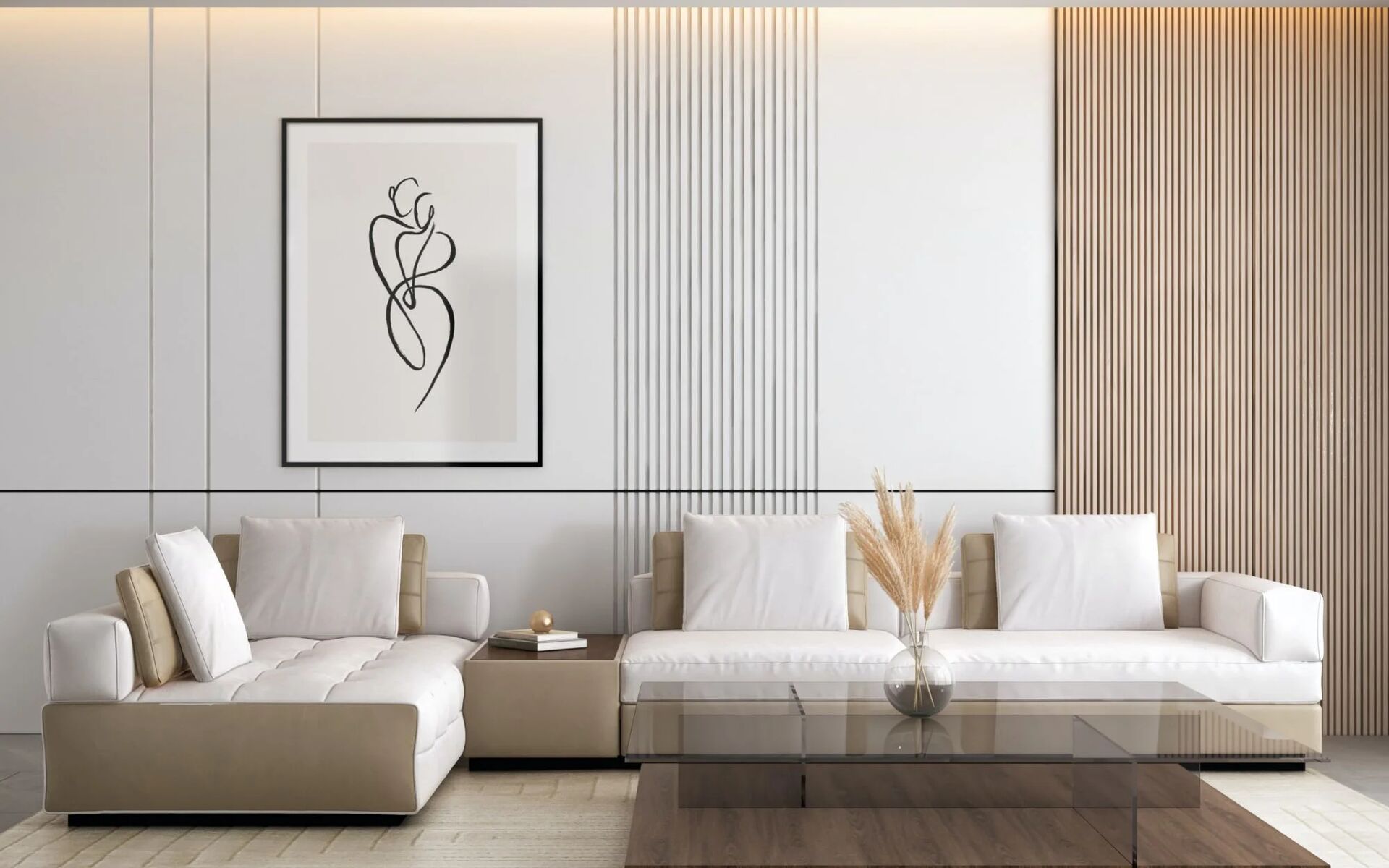
Color Psychology In Interior Design
January 10, 2025 7 min read

Understanding How Colors Affect Mood And Atmosphere In Your Living Spaces And How To Use Them Effectively.
Crafting spaces...
Understanding How Colors Affect Mood And Atmosphere In Your Living Spaces And How To Use Them Effectively.
 Trends
As we step into 2025, the interior design world is buzzing with fresh ideas and innovative approaches that promise to transform our living spaces.
 Sustainability
Explore Eco-Friendly Materials And Practices That Are Revolutionizing The Interior Design Industry.
 Space Planning
Clever Design Strategies To Make The Most Of Compact Living Spaces Without Compromising On Style.
 Design Tips
Learn how to seamlessly blend contemporary aesthetics with traditional elements for a timeless interior.
 Workspace
Essential Tips For Designing A Productive And Comfortable Home Office That Enhances Your Work-Life Balance.
 Lighting
A Comprehensive Guide To Layered Lighting And How To Create The Perfect Ambiance In Every Room.
 Hospitality
Interior Design Solutions for Modern SpacesA well-designed interior makes any home, office, or hotel more attractive, comfortable, and functional. ...
TrendsAs we step into 2025, the interior design world is buzzing with fresh ideas and innovative approaches that promise to transform our living spaces.
SustainabilityExplore Eco-Friendly Materials And Practices That Are Revolutionizing The Interior Design Industry.
Space PlanningClever Design Strategies To Make The Most Of Compact Living Spaces Without Compromising On Style.
Design TipsLearn how to seamlessly blend contemporary aesthetics with traditional elements for a timeless interior.
WorkspaceEssential Tips For Designing A Productive And Comfortable Home Office That Enhances Your Work-Life Balance.